Maximo Manage UI Differences for the Maximo 7.6.x User
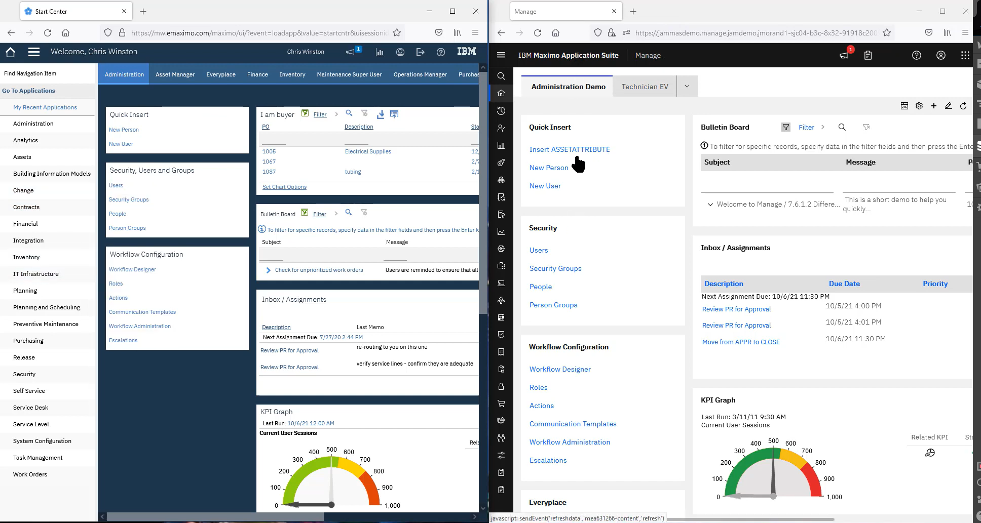
As Maximo 7.6.x moves into the ‘Manage’ application within the Maximo Application Suite, the Maximo User Interface has changed to As Maximo 7.6.x moves into the ‘Manage’ application within the Maximo Application Suite, the Maximo User Interface has changed to be more in line with the rest of the applications in the Suite. Many thanks to the IBM Team saddled with the responsibility of aligning the Maximo user interface to the rest of the Application Suite (Monitor, Health, etc.).
Even though the ‘skin’ which represents the look and feel of the application throughout has changed, basic functionality remains mostly the same in Manage. The largest exception would be around creating users which needs to be done at Maximo Application Suite (in Suite Administration) level before they can be in Manage, and then the security groups / rights are assigned in Manage, like they are now.
To the Maximo 7.6.x user, differences can appear stark and perhaps overwhelming. They are, until you understand the base level changes and then you can apply them throughout, and quickly get acclimated to Manage. Let’s look at them by key area of the application.
Colors and Spacing
Colors have changed and generally provide a bit more contrast overall, and they have also been used for emphasis for certain elements. The traditional yes/no checkbox is now a toggle that will be a bright Green when yes; Action buttons (‘Actions’, ‘Select…’, etc.) within application tabs, (as well as start center portlet designer) are a bright Blue for emphasis, making them easier to spot, and these Action buttons have also been used to create a menu that will consolidate what were individual buttons, usually freeing up 1 screen row of buttons on a sub-tab. These will generally be to the right, as opposed to the individual buttons that were on the left, so look for them.
One other spacing note: when your browser is not maximized on your screen, icons/menus/etc., that would be cut off, will likely be available. The designers have tried to provide access to controls that would normally be hidden when your screen is not maximized width-wise; vertically, there will still be challenges.
Start Center
Each portlet type is still there, so if you upgrade, they will upgrade. If you are starting anew, you generally build them the same way, but keep in mind the buttons have moved. OK and Finished have the new Blue for emphasis, but they are now to the right instead of the left. Colors are shaded a little differently, so red will look different, but it is still red, and so on.
Application Breadcrumbs
Virtually no change at all. Still in the same place (top, left side) with one cosmetic difference. Let’s say you hyperlink from Work Order Tracking to Assets to Locations. When you get to Locations, ‘Locations’ will just be the application title, but it will no longer be in the Breadcrumb listing (it was not actionable anyway since you are already in the application).
Navigation
The list of modules and the cascading list of applications is still there, but the list of applications will cascade down, instead of to the right. Further, the list compresses to a vertical ribbon the height of the browser tab and is always there, except when you hyperlink to another application. The ‘Find Navigation Item’ now appears in 2 places and searches differently. Within an application, it will just search what is accessible in the application; from the start center, it will work as it has in the past, searching through all of Maximo that the users can access.
Application List Tab
The list tab has numerous subtle differences:
Application Main / Other tabs
Tab breadcrumbs (titles) will appear once you display the main tab. Vertical labels system property is no longer available; labels will now only appear above the data field, all the time. The typical exception for most ‘Description’ fields, will continue to be unlabeled. Checkbox becomes a toggle / slider depending on how you look at it; to the left for off and to the right for on (on will also be green).
Further, there is a video available in the MORE community with some side-by-side comparisons to help you in your journey to Manage. It is less than 20 minutes long, and you do not need to be a member to view it.
No comments:
Post a Comment